
How I Photograph Action: Framing, Timing, and the Marvel Approach
Action photography is often described as freezing a moment. That’s part of it. The harder job is deciding which moment deserves to be held still.
A photograph has to survive more than a glance. You can look at it again and again. You notice where the focus landed, what the subject’s body is doing, what the background says, and whether the frame has enough room to breathe. Nothing moves on to cover a weak choice. The expression, color, focus, and framing all have to earn their place.
That’s the way I approach a shoot. I’m not trying to make real life look perfect. I’m trying to show it with intention.
My starting point: real life, shaped by a point of view
My work starts with real people doing real things. I don’t want to remove every stray detail or polish the life out of a scene. I want to preserve what happened, then make small, deliberate choices that help the viewer see what matters to me.
I shape that view through the angle, framing, timing, focus, and color. The result should feel active, outdoors, creative, cinematic, or connected to performance. Sometimes one of those qualities carries the image. Sometimes several work together.
The image should say something, even if it doesn’t explain everything. I want viewers to feel the scene and bring some of their own experience to it.
The Marvel approach to framing
I call one part of my approach the Marvel method. It’s my own analogy to the visual energy of a comic-book panel, where the figure, the action, and the surrounding space all help make the frame feel alive.
I try to fill the frame with the subject, the environment, or a purposeful combination of both. I want the image to have enough visual information to pull you in. The background shouldn’t be dead space by default. It can show where the action is happening, add scale, create tension, or give the subject something to push against.
This doesn’t mean cramming every corner with detail. Each part of the frame needs a reason to be there. The subject has to read clearly. The setting has to add something. The lines and shapes should lead the eye toward the action or help the viewer feel its direction.
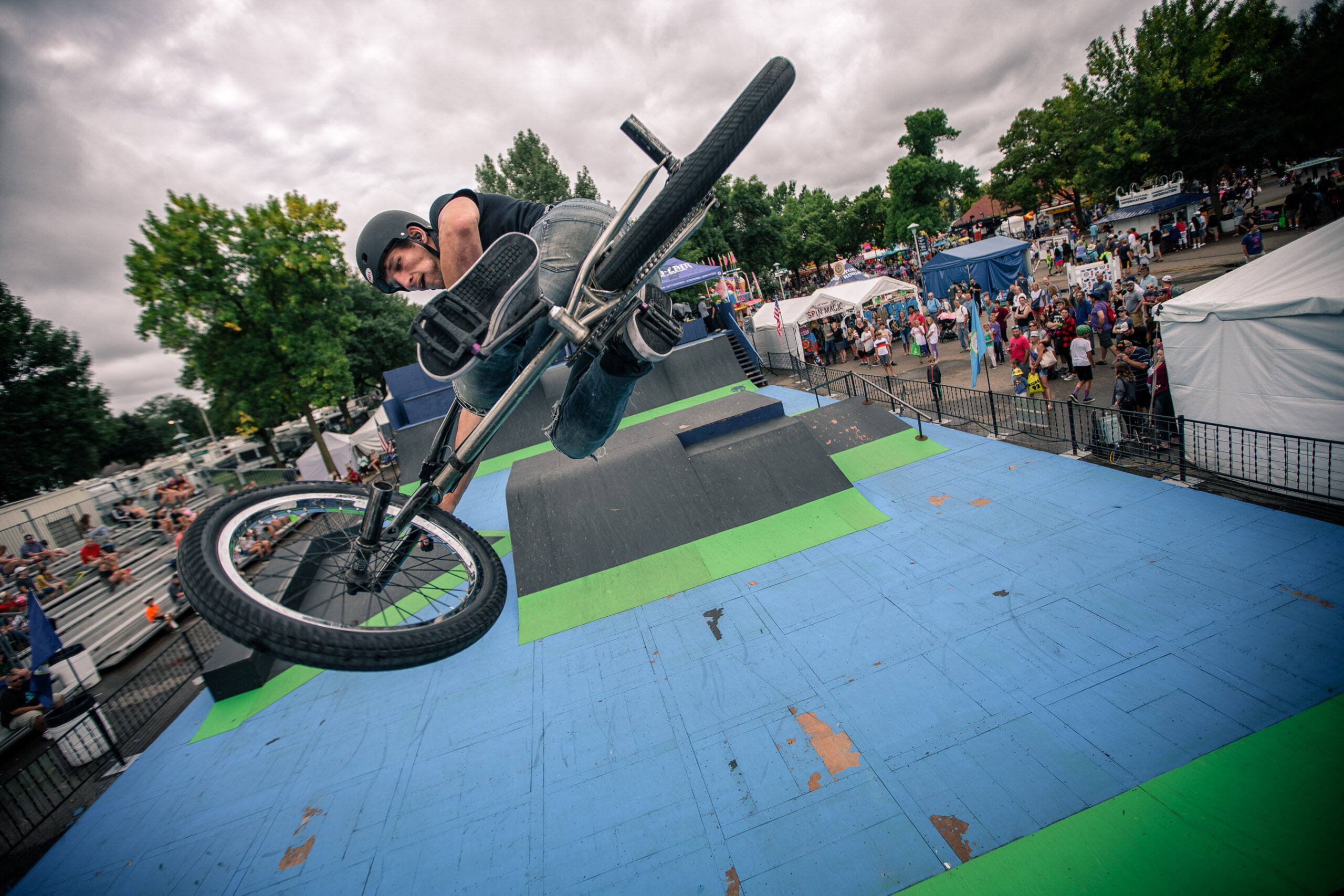
I often work from a low angle, especially with fitness subjects. From down there, a person can look larger, more powerful, more heroic. The viewer looks up. The subject takes up space and seems to own it. That choice is deliberate. I’m using the camera’s position to change how the subject feels in the frame.
I also use a tilted horizon when it supports the action. A Dutch angle can make the viewer feel slightly off balance. It can suggest that a subject is driving, falling, turning, or moving with force. I don’t tilt the camera just to make an image look edgy. The angle has to add to the feeling of the photograph.
The test is simple: does this point of view help the viewer feel what is happening? If it only calls attention to itself, it isn’t doing its job.
Trust, movement, and the decisive moment
People move differently when they trust the person photographing them. With an athlete or fitness subject, comfort can mean the difference between a real movement and a pose that looks like a movement. I work to build that comfort, then pay attention to how the person carries themselves.
I move around the subject and look for a frame that feels right. I don’t assume the obvious angle is the best one. A slight change in height or position can make the subject look stronger, reveal a line of movement, or bring the surrounding space into the story.
Action is time-sensitive. You can’t ask someone to repeat the same moment forever. I shoot a lot of frames because I’m trying to catch a particular position, expression, or instant when the movement reaches its peak. That doesn’t mean firing without thought. I’m watching the subject, anticipating what may happen, and tracking the composition, focus, and background while the action unfolds.
When I review the sequence, I’m looking for the frame where everything comes together. The best frame might be the highest jump or the biggest lift. It might also be the instant before impact, the recovery after a difficult effort, or a look that says more than the movement itself.
The camera work and the edit
I think of my process through the stages of making a comic-book image. It’s an analogy, not a literal production pipeline.
The photographer is like the penciler. I establish the basic form: subject, action, point of view, and composition. I’m deciding what enters the frame and what the viewer will notice first.
The first edit is like inking. I choose the frames that give the shoot its shape. I look for the strongest expressions, positions, compositions, focus, and moments. The selection gives the work its direction.
Retouching and color are like the finishing pass. I bring out the detail that matters, reduce distractions when needed, and give the image its final visual direction. But I want to keep the subject recognizably real. I’m not trying to retouch a person into somebody else.
Composition, focus, color, and meaning
When I evaluate an image, I return to four questions.
Composition: Where is the subject? What fills the frame? Do the lines lead somewhere useful? Is the background helping or fighting the photograph?
Focus: What needs to be sharp? Where does the viewer look first? Does the focus support the action and the meaning?
Color: What does the color make the viewer feel? Does it support the light and the mood of the scene? Color should be a decision, not a filter applied out of habit.
Meaning: What are we looking at? What is the image saying about the person, activity, brand, or experience? What should the viewer take away?
The image’s purpose doesn’t have to be a sales pitch. It may be showing strength, speed, concentration, community, or the effort behind a performance. But I want to know what the photograph is about before I call it finished.
Color and black-and-white choices
I don’t treat black and white as color with the saturation removed. Black-and-white images need their own tonal decisions. Skin, grass, sky, and clothing can all become different shades of gray. Those choices change what holds attention and how the image feels.
Sometimes black and white is more direct. It can strip away color and make the viewer stay with the subject, expression, form, or contrast. But it should be a deliberate choice. If the image needs its color to carry the feeling or identify the scene, removing it may weaken the photograph.
Color grading works the same way. I ask what the color is doing for the image. Is it building warmth, distance, tension, or energy? Does it guide the viewer through the frame? The grade should strengthen the photograph’s meaning. It shouldn’t cover up a frame that has no meaning to begin with.
What clients are hiring
Clients hire my point of view as much as my ability to operate a camera. They bring me into their sport, business, product, or environment so I can interpret it through the way I see.
We should agree on what the photographs need to communicate and how the client plans to use them. Then I need room to make visual decisions on set. If a client wants a specific photographer’s look copied frame by frame, I’m probably not the right fit. If they want to see their work through my perspective, that’s where I can contribute.
A practical review for photographers
When you photograph action, start by asking what the image needs to communicate. Find the angle that gives the subject the right presence. Use the environment as part of the frame. Watch the movement closely and keep shooting through the sequence. Then choose the frame where the pose, focus, composition, and expression come together.
In the edit, don’t ask only whether the image looks polished. Ask what the composition says, where the focus takes the eye, what the color makes the viewer feel, and whether the photograph still feels like something that happened to real people in a real place.
That is the standard I’m working toward. Real life, framed with intent, and finished with enough care to make the viewer stop and look again.